Memphis Brooks Museum of Art Case Study
Previous Brand Look & Feel

Benchmarking
Before the design exploration, a benchmark study was conducted to assess how other museums apply their brand across all channels. Research focused on the overall brand impression with special emphasis on key areas of concern for the Brooks: the use of color, logo placement, imagery, and overall brand consistency.
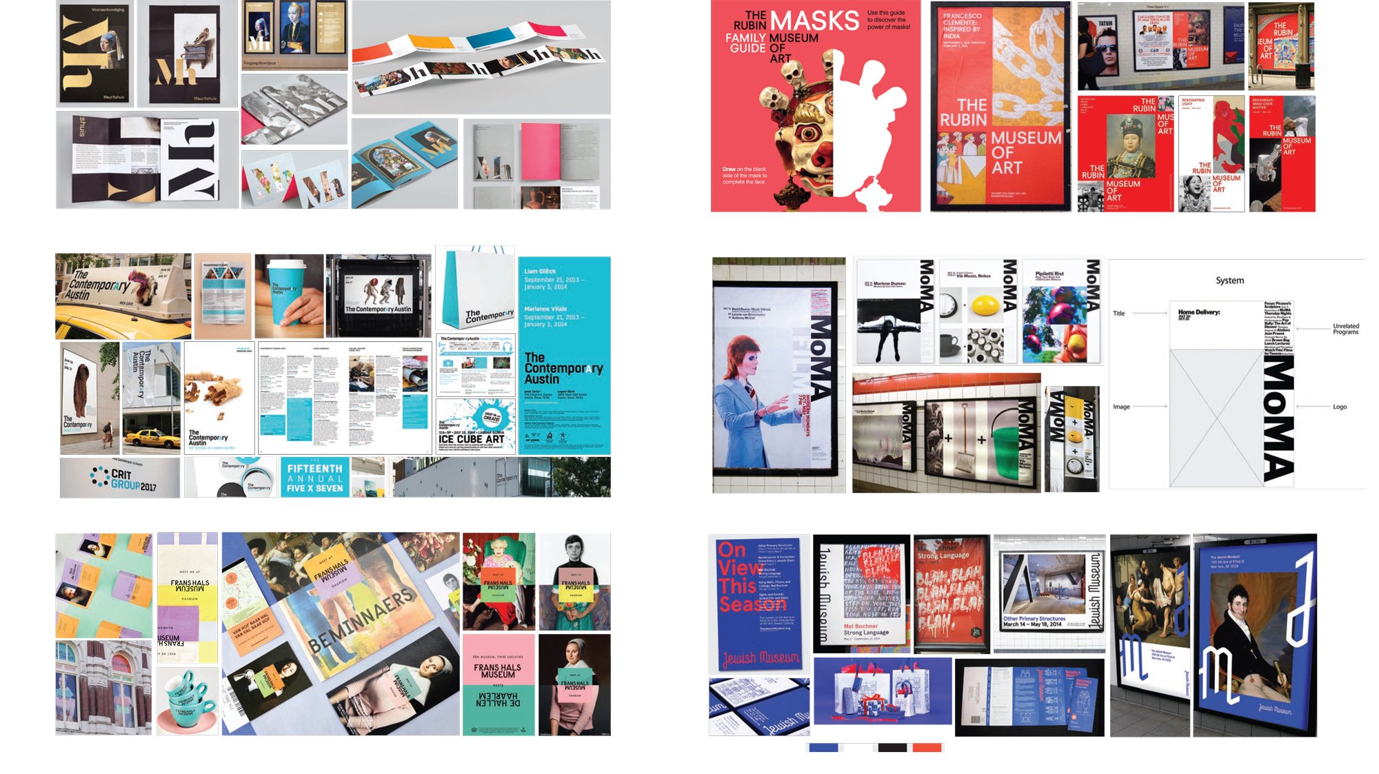


Benchmarking Takeaways
Museums create a strong brand impression by using at least one systematic approach through either: color, typography, framework or logo placement. The museum brand identity is at the forefront of all external communications rather than exhibitions, programs, or events. The lack of a systematic approach waters down the impact of the brand. Over time, the consistent application of a system makes the brand so recognizable that the logo can be used without the name. The short usage of letters, logo, and consistent approach become the embodiment of the brand, distilling its core identity into its purest form.
Design Framework Approach
This exploration is anchored by a clean and modern framework that delivers an immediately recognizable brand identity. The pairing of the B logotype and artwork represents the interaction one will experience at the museum. The layering is flexible—it works e ectively with either the B or the artwork on top—to accommodate artwork restrictions, when needed. The use of color, while scaled back, still accommodates a wide range of imagery.
This system:
Provided a clear system of color using red (primary), 90% black, and white.
Allowed for layering of the logotype or artwork, depending on artwork restrictions.
Established a strong grid system through a placement for all elements: exhibition titles, dates, artwork, logotype, museum name, credit lines, and sponsors.
Introduced a brighter red that allows for layering of black text and infuses more energy.
Overall, this approach sets a tone, and establishes a bold and memorable look and feel that modernized institution's image.

Transition Strategy

During this introductory phase, the full museum name is included on all communications for a two-year period.

After a two-year period, the full museum name is removed, and the iconic B symbol subtly increases in size.